Check text contrast before choosing your colours
The same green, a different background, and a different result. Four pairs you can try yourself.
A green that looks good in a palette can be hard to read as a small label. Check the text colour together with its background before using it across a design.
Here are four combinations you can reproduce in Colour studio. The third uses exactly the same green as the second; only the background changes.
A background change can turn a pass into a fail
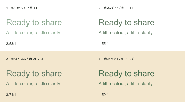
| Sample | Text / background | Contrast ratio |
|---|---|---|
| 1 | #8DAA91 / #FFFFFF |
2.53:1 |
| 2 | #647C66 / #FFFFFF |
4.55:1 |
| 3 | #647C66 / #F3E7CE |
3.71:1 |
| 4 | #4B7051 / #F3E7CE |
4.59:1 |
Samples 2 and 4 pass the WCAG AA contrast threshold for normal text. Samples 1 and 3 do not. The numbers shown here are rounded for display; the checks use the full calculated values.
Changing white to cream made sample 2 fail. Darkening the green in sample 4 brought it back above the threshold. These are example colours, not a required palette for your project. Download their CSS to try them in your own layout.
Check the size of the text too
WCAG's text-contrast guidance sets a minimum ratio of 4.5:1 for normal text at level AA. Large text has a lower threshold of 3:1. “Large” means at least 24 CSS pixels for regular text, or about 18.67 CSS pixels for bold text.
That distinction matters for a small label underneath a headline. A colour pair can pass for the headline and still fail for the label. Judge each at its actual displayed size, including when a social image is scaled down in a feed.
Do not round a failing value up to a pass. A result of 4.499:1 is still below 4.5:1.
Try the four pairs in the tool
- Open Colour studio and choose Contrast.
- Enter the first pair in Text color and Background color.
- Check Normal text AA, then compare Large text AA.
- Repeat with the other pairs. For samples 2 and 3, change only the background to see why both values matter.
- Put your chosen pair into the real design and read it at its final size. Check smaller labels and links, not just the large sample heading.
On a phone, the preview and settings appear one after the other. The checks use the same values as on desktop.
Solid colours are only the starting point
The checker compares two opaque, solid colours. It does not inspect every pixel behind text on a photograph or gradient, or account for a partially transparent overlay. Check the lightest and darkest areas under the lettering, or give the text a solid panel whose colour you can test.
Try the design in both light and dark themes if you offer them. Passing on a white card says nothing about the same text on a dark menu. Thin lettering can also be harder to read than the ratio suggests, so leave some margin above the minimum instead of aiming for the nearest possible pass.
What we checked
On 5 October 2026, we ran all four pairs through the same contrast function as Colour studio. The results file records the exact ratios and AA decisions. The downloadable CSS and illustration use those same colour values.
This checks text contrast, not the accessibility of an entire page. It does not assess keyboard access, labels, reading order or whether someone can understand your content.