Screenshot padding vs inset: give your image room
One screenshot, three exports: see which space belongs outside the card and which belongs inside.
Padding puts space between a screenshot and the edge of its background. Inset adds space inside the screenshot's card. Use padding when the whole composition feels cramped; use inset when text or controls sit too close to the card's rounded corners.
These examples use the same 800 × 400 sample screenshot. It contains invented checklist text, so you can try every setting without uploading a private screen.
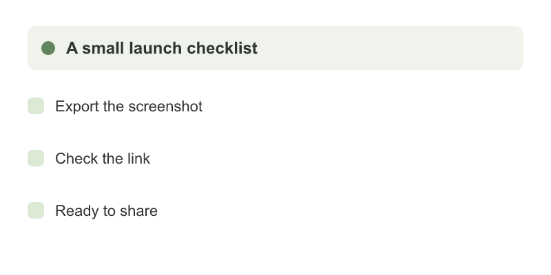
Start with padding, then add inset
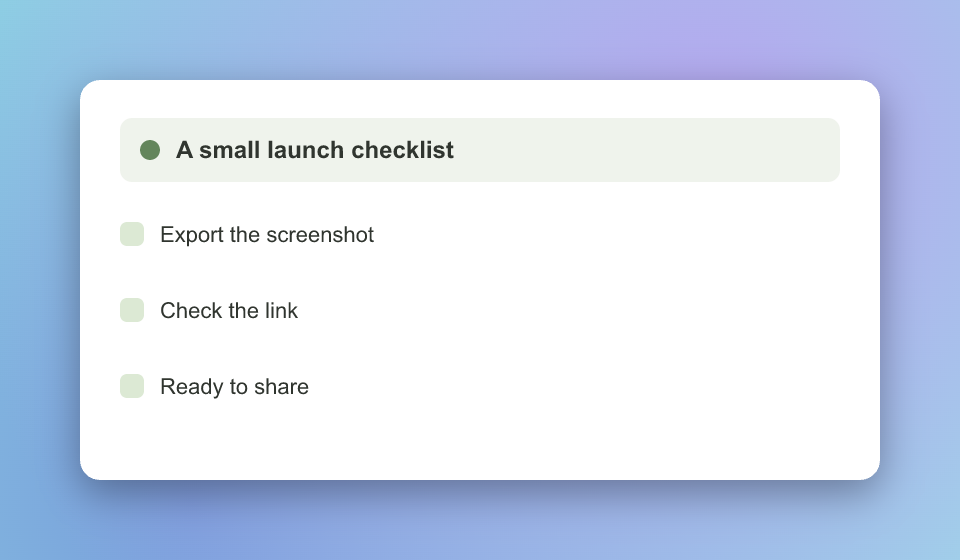
Open the Screenshot beautifier, upload the sample and choose Reset style. Under Frame, keep Frame style on Image only. The defaults are Padding 80, Inset 0, Border radius 20 and Shadow 40.
That produces a 960 × 560 PNG: 800 + 80 + 80 across, and 400 + 80 + 80 down. The Aurora background sits outside the card.
Now move Inset to 24. The screenshot keeps its size, but its white card grows by 24 on each side. The export becomes 1008 × 608. Text has more room inside the rounded edge, while the outside padding stays at 80.
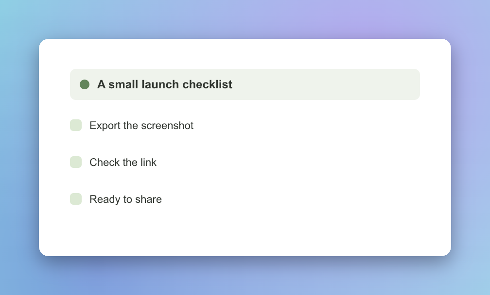
Download the padding-only version and the version with inset to compare at full size. These exact pixel sums apply to this sample with automatic sizing; larger sources and fixed export sizes can scale the whole composition.
Match the inset to the screenshot, not the background
When inset is above zero, Inset color offers Match image edges or Custom color. The automatic option samples the screenshot's edges and chooses a dominant opaque colour. Our white-edged sample gives #FFFFFF.
This works well for a screenshot with a plain border. A photo, gradient or screen with different colours along its edges may show a seam: the inset is one colour, not newly generated image content. Choose Custom color and adjust Hex color if the automatic match looks wrong.
The Background tab controls the outer area independently. Changing that gradient does not change the screenshot's own colours.
A square canvas adds room; it does not crop
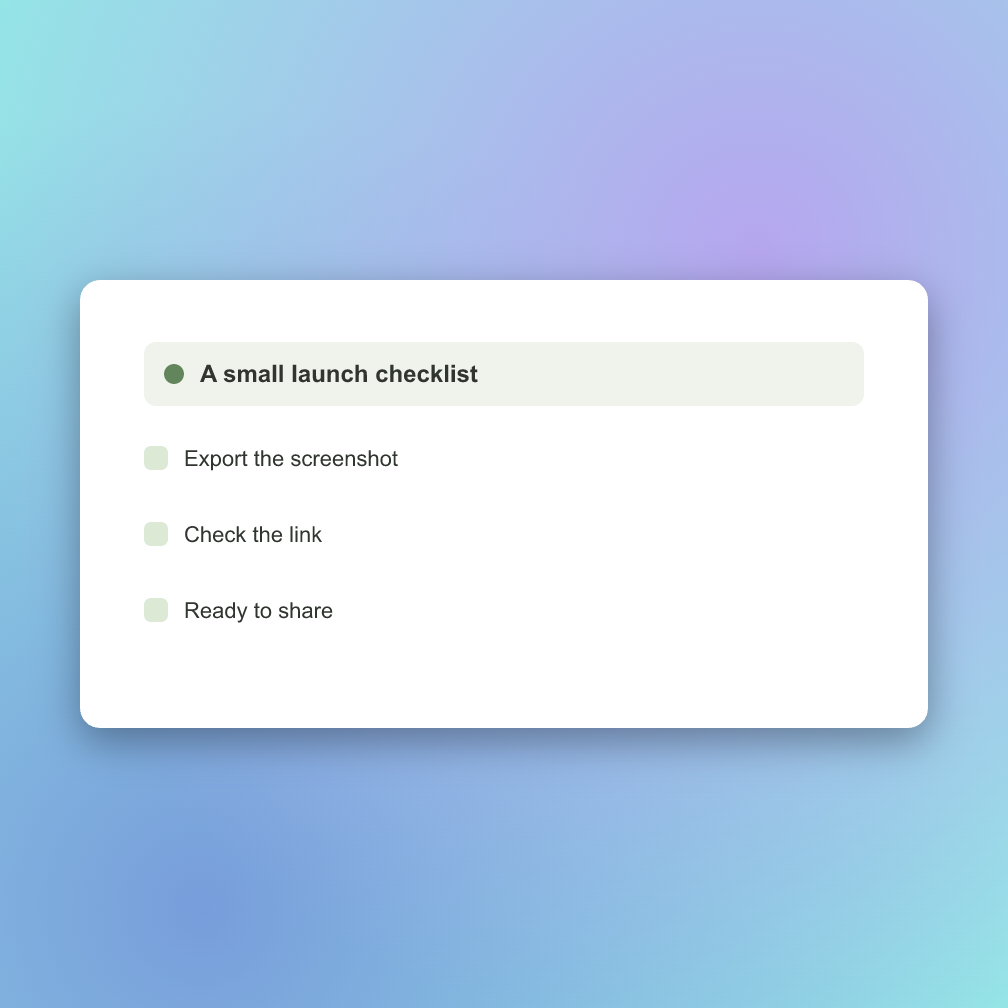
Under Size, change Aspect ratio from Auto · fit image to 1:1 · Square, leaving Export size on Auto · up to 4096 px. With the 24-pixel inset, the result is 1008 × 1008. The card stays centred, with more background above and below it.
You can inspect the square export. If you want the screenshot itself to fill a square, crop it first with the image cropper. A long screenshot squeezed into a small square may preserve every line while making the text too small to read.
Check the exported size before saving your style
Download the PNG and view it at the size your audience will see. Zooming into the tool's preview helps you inspect edges; it does not increase export resolution. On mobile, open Adjust to reach the settings and Preview to inspect the result.
Browser window adds a decorative title bar. Its light/dark appearance changes that frame only, not your uploaded screenshot. Keep Image only if your capture already includes a browser bar.
Once you like the result, Save preset keeps the style in this browser for the next screenshot. It does not sync to another device.
On 12 October 2026, we downloaded all three PNGs from the tool and checked their dimensions against its layout function. The results file records the settings and file hashes so you can reproduce the comparison.